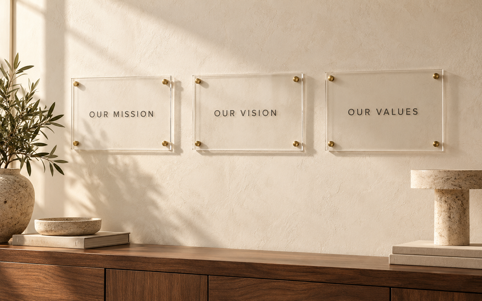
A bilingual mission and values wall is more than an English layout with another language fitted into the remaining space. Both versions need to communicate the same approved meaning, and both need room to breathe. Plan the languages together from the beginning so translation is part of the communication project rather than a late production change.
The central buying decision is whether the languages belong on one shared panel, parallel panels, or separate displays in different locations. Make that decision with actual approved translations in hand.
Name the audience for each language
Identify who will use the display and which languages they read comfortably. Do not assume that the office’s working language is the best choice for every visitor or employee. Ask the relevant teams what the wall needs to communicate and in which contexts.
If one language has a clearly different audience, separate placement may be practical. If both groups use the same space equally, a coordinated layout can avoid making one translation feel like an afterthought. Document the reason for the chosen hierarchy.
Translate meaning before fitting lines
Give the translator the mission, values, supporting explanations, and a short description of the organization. A one-word value may need context to produce the intended meaning. Provide approved terminology and identify phrases that have a specific internal definition.
Ask a qualified reviewer to check the translation before layout. Do not shorten a translated sentence merely because it occupies more space than the source. If editing is necessary, have the language owner approve it and confirm that the organizational commitment remains equivalent.
Compare layouts with the full text
Test side-by-side, stacked, and separate-panel arrangements using every line. Different languages can have different word lengths and reading directions, so equal word counts do not guarantee comparable layouts. Let actual content guide the composition.
Use clear language labels when they help readers navigate. Keep related headings and explanations together. A person should not have to jump between distant areas of the wall to find the translated explanation of a particular value.
Include language review in the final check
The reviewer should inspect the final visual layout, not only the source document. Check accents, punctuation, special characters, line breaks, and whether the reading order still makes sense. A correct sentence can become confusing when split badly or paired with the wrong heading.
Provide a way to identify each text block unambiguously during feedback. For example, label the third value’s explanation in each language rather than asking someone to “fix the middle paragraph.” Consolidate corrections into one updated source file.
Plan updates as linked changes
If the mission or a value changes, review all language versions together. Keep the source and translations in the same controlled record with named owners. Otherwise, one panel can quietly become newer than its partner.
Where space is limited, a shorter approved statement plus a separate detailed resource may be better than squeezing two dense paragraphs onto one panel. This is a content choice that needs organizational approval, not an automatic design shortcut.
Frequently asked questions
Should both languages use identical type sizes?
Aim for comparable readability and an intentional hierarchy. A language reviewer and the actual layout should guide the final decision.
Can automatic translation be the final copy?
For a permanent organizational statement, have a qualified human reviewer confirm meaning, terminology, and the finished layout.
Can we add another language later?
Possibly, but ask how it will fit the display system before buying the initial set. Later additions may require redesign.
Start with both approved versions
Bring your complete language files and intended audience to the Toprak Creative B2B signage page. Ask about a coordinated mission-and-values layout before selecting the final format.