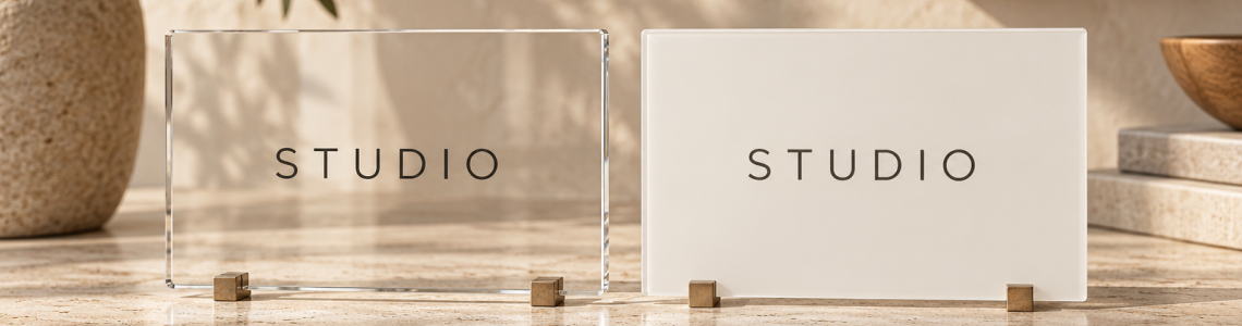
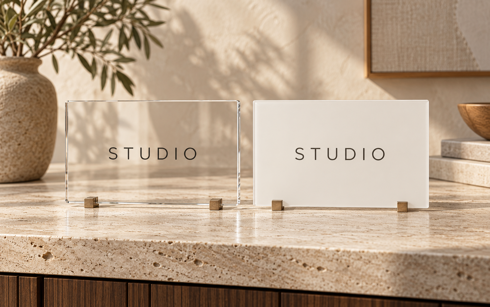
A clear sign background lets the wall become part of the composition. An opaque background gives the artwork a more defined field. Neither choice is automatically more polished. The better option depends on the logo, the wall, and how much control you need over the background behind the business name.
Start with those design questions before assuming a transparent preview represents a finished installation. The appearance of clear material, printed areas, reflections, and the wall can be difficult to communicate faithfully on a screen.
Consider what sits behind the lettering
A quiet wall may support a restrained design that appears to float in the room. A textured, patterned, or strongly colored wall creates a different situation. Parts of a multicolor logo may read clearly while other parts become difficult to separate from the background.
Use a photo of the actual wall, not a generic white interior, during the design discussion. Identify the weakest contrast within the logo. A pale tagline can be the limiting element even when the main name looks strong. If the wall changes color next year, that same design could need another review.
Ask what clear means for your order
Clear describes the substrate appearance, but it does not fully describe the finished print. Ask how the selected artwork will be reproduced and whether any backing or white-print treatment is part of the proposed design. Do not infer that every area shown white in a digital file will be transparent, or that every transparent area will look identical after production.
Request an explanation of which parts are clear, which are colored, and which are intended to appear opaque. Keep that explanation with the proof. It is especially helpful when someone approving the sign did not attend the original conversation.
Decide how independent the sign should be
An opaque background can create a visually separate brand area when the surrounding room is busy. It may also be worth considering when the logo must remain easy to recognize across several offices with different paint colors. Availability and production details still need confirmation for the particular product.
A clear-background approach may suit a room where the architecture is intentionally part of the design. Its success depends on reviewing the room as a whole, including visible seams, wall texture, and lighting. Do not choose clear simply because it looks minimal in an isolated product image.
Compare the same layout fairly
Keep the panel size and logo proportions consistent when comparing background concepts. Otherwise you may favor one version because the name is larger, not because the background is better. Review each concept against the same wall photograph and under the same assumptions.
If precise appearance is important, ask what physical reference or sample process is available and what it can demonstrate. A small sample may help answer a material or print question without showing the complete room effect. Treat a digital preview as a layout aid, with final transparency and color questions explicitly resolved before ordering.
Your planning checklist
- Photograph the actual wall color and texture.
- Identify low-contrast logo elements.
- Clarify clear versus printed areas.
- Confirm available background treatments.
Frequently asked questions
Will a clear sign work on a dark wall?
It may, depending on the artwork and production method. Review every important element against the actual wall and ask how printed areas will be handled.
Does a white area in my preview mean white ink?
Not necessarily. It could represent the page background, a printed area, or a backing treatment. Ask the maker to label the intended result clearly.
Which background is easier to reuse after a move?
An independent background may simplify some design decisions, but reuse also depends on dimensions, condition, mounting, and the new room. Evaluate the new space before deciding.
Plan your next step
Review Toprak Creative’s reception logo sign and ask which background treatments are available for your selected design. Include a wall photo so the conversation starts with your real setting.