
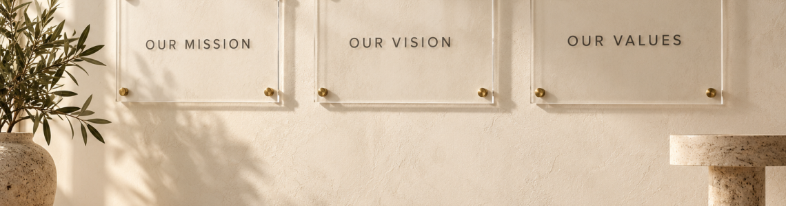
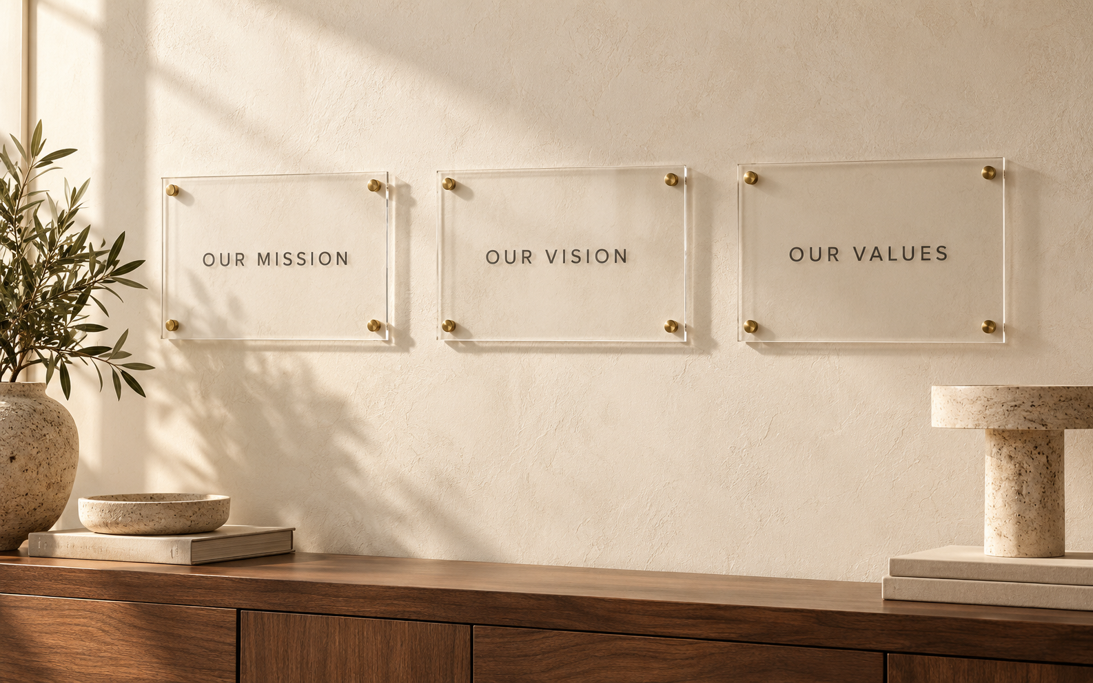
Choosing between one core values panel and a coordinated set is a content decision as much as a design choice. A single panel keeps the message together. Separate plaques give individual values more room and can suit a wider wall. Neither format is automatically better: the right choice depends on how much explanation each value needs and how the space is used.
Before ordering, gather the approved values and any behavior statements that belong with them. Count the actual words, not just the number of headings.
Compare complete content, not empty layouts
“Curiosity” is easy to fit on a small sample. “Curiosity: ask useful questions before recommending a solution” requires a different composition. Compare panel options using your longest real value and its description so that the design does not work only for the shortest item.
If some values have explanations and others do not, decide whether that is intentional. Uneven content can be managed, but the sign maker needs to know whether editing or layout should solve it.
Choose one panel for a unified reading sequence
A single panel is useful when people should read the values as one complete statement. It also gives you one artwork file to approve and one overall position to coordinate. Check that the headings remain distinguishable rather than becoming a dense block of text.
Its main trade-off is change management. If one value changes later, the whole panel may need replacing. Ask about the implications for your chosen construction instead of assuming individual printed sections can be updated.
Choose separate panels for flexible grouping
A set can give each value its own identity while sharing type, color, and spacing. It may suit a long wall or a layout that connects related working areas. Decide whether each plaque must make sense alone; a person may encounter only one of them.
Separate pieces create more installation coordination. Supply a placement drawing showing order, gaps, overall width, and alignment. A consistent gap matters just as much as matching panel sizes when the set is viewed together.
Test whether repetition helps
Repeating a heading style can make a set feel coherent. Repeating a large company logo on every small plaque can consume valuable reading space. Ask what repetition accomplishes for the reader and remove elements that only add visual noise.
For illustrative copy, “Ownership: make the next step clear” and “Care: check how the decision affects others” show the difference between a value label and a behavioral explanation. These are examples for planning, not claims about any client’s workplace.
Plan the future replacement path
Keep an approved master for the whole set and an identifier for each panel. Record the finish, size, and exact wording. If a damaged panel needs replacement, those records reduce uncertainty, although a future match still needs confirmation.
Consider whether the values are stable enough for permanent production. If the company is actively rewriting them, finish that work first. A coordinated display should support an agreed message, rather than become the deadline that forces rushed wording.
Frequently asked questions
Is a separate plaque needed for every value?
No. Group related values when that makes the content easier to read and the layout easier to place.
Should all panels have identical dimensions?
Identical dimensions can help coordination, but test the longest content before choosing them.
Can a values wall replace staff communication?
No. It displays the message; discussion, leadership decisions, and everyday practice give that message context.
Compare your options
To price one values panel, start with Toprak Creative’s personalized acrylic wall plaque and check the size, options, and quantity of the selected product before ordering. For a coordinated set, use the B2B signage page to start a discussion with your complete values text, preferred grouping, and a measured wall photograph.