A detailed logo can look excellent in a brand presentation and still need a more considered layout on a reception wall. The problem is not necessarily the logo itself. It may be the selected size, the amount of supporting text, or the distance from which visitors see it.
Simplifying a sign layout should protect the identity rather than casually redraw it. Start by asking which parts are essential and which approved alternatives already exist.
Diagnose the actual problem
Look at the proposed artwork at its intended size and viewing position. Is the business name too small? Are decorative details difficult to distinguish? Does a tagline force the main logo into a cramped area? Name the specific problem before changing anything.
A larger panel will not automatically solve a composition in which the logo occupies only a small portion of the available space. Conversely, removing a meaningful symbol may be unnecessary if the issue is simply too much optional copy. Match the adjustment to the problem you observed.
Search the existing brand system
Many identity packages include horizontal, stacked, symbol-only, or single-color versions. Confirm which variations are approved and when they may be used. An alternate lockup can fit a different wall proportion without inventing a new identity.
If only one logo exists, ask the brand designer about an appropriate signage adaptation. Define the use, approximate dimensions, and viewing context. A purposeful revision is easier to approve and repeat than a series of undocumented edits made during production.
Remove optional content before altering core artwork
Review the tagline, web address, founding date, and service list separately. Each may be valuable somewhere, but all of them may not belong on the main reception panel. Consider whether that information is available in a more appropriate place.
Try a logo-only composition and compare it with the fuller version at the same overall size. If the main identity becomes clearer, you have useful evidence for a content decision. Do not remove wording that has a specific required purpose without the appropriate review.
Ask for a production assessment
Fine lines, small spaces, and complex effects deserve review against the selected production method. Ask the maker to identify details that may need attention at the chosen artwork size. Avoid applying an arbitrary minimum detail rule before the actual product is known.
When an adjustment is proposed, request a comparison showing the original and revised artwork. Have the brand owner approve visible differences. Keep the source file intact and save the approved sign adaptation as a clearly named derivative, with notes explaining its intended use.
Test the simplified layout honestly
Compare the alternatives on the actual wall photo and, where practical, at approximate full size. Do not make the simplified option larger or better lit in the comparison. You want to know whether the layout itself solves the problem.
Ask someone unfamiliar with the design what they notice first and what name they read. Treat this as informal feedback, not proof of universal readability. Once the choice is made, use the approved file consistently and archive the rejected alternatives away from the production package.
Your planning checklist
- Identify the specific layout problem.
- Check for approved alternate lockups.
- Review optional supporting copy.
- Save any approved adaptation separately.
Frequently asked questions
Should a complex logo always be simplified for signage?
No. First test it at the intended scale and ask for a production assessment. Some layouts work well without any artwork changes.
Can we remove the tagline without changing the logo?
Only if that use is consistent with your brand approval. Check whether an approved logo-only version exists rather than deleting elements informally.
Who should approve a signage adaptation?
The person responsible for the brand should approve visible artwork changes. The sign maker can advise on production, but should not be expected to decide your identity.
Plan your next step
Send your approved logo options when discussing a reception logo sign. Ask which layout fits the selected size and production approach before authorizing any visible artwork changes.
References
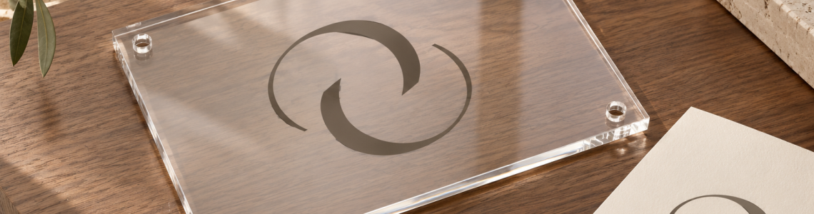
Cover image: AI-generated editorial visualization of an acrylic-style sign and artwork-proof workspace; illustrative design planning, not a customer order.