
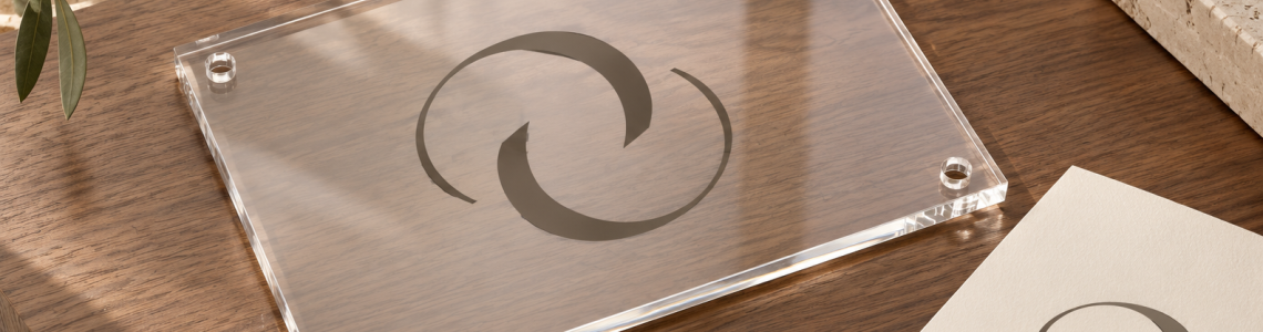
A small reception area benefits from clear priorities. When the desk, seating, door, and logo share a compact space, every extra line of text competes with the room. The aim is not to make the largest possible sign fit. It is to create a clear point of recognition without overwhelming the available wall.
Begin with the room’s actual constraints, then compare a few restrained layouts using the same approved brand artwork.
Choose one main brand moment
Identify the place visitors naturally look when arriving. In a compact office, that may be a wall behind a small desk or a visible section beside the entry. Avoid distributing the same logo across every surface simply because each individual display is small.
One deliberate sign can work with quieter supporting elements. Keep appointment instructions, notices, and other operational information organized separately. If everything competes for the same attention, enlarging the logo may only add to the clutter.
Use proportion rather than a maximum size
Measure the usable wall area after doors, lights, shelves, and switches are accounted for. Compare the sign with the furniture beneath it. A narrow desk can make a moderately sized panel feel substantial even when the wider wall has room for more.
Test two paper outlines and include the approximate artwork area. Step back to the entrance and sit where visitors wait. Pay attention to the surrounding space, not just the logo. A composition can feel more intentional when the panel has breathing room around it.
Reduce content to what visitors need
Start with the business name and approved symbol. Add a descriptor only if it contributes useful identification. A long tagline or service list may force the name to become smaller, defeating the purpose of a prominent reception display.
If the brand offers a compact or stacked lockup, compare it with the horizontal version. Preserve approved proportions. Do not compress the logo to fit a narrow gap or break the name into awkward lines just to use a preferred panel shape.
Make the background a conscious choice
A clear-background concept may allow the wall to remain visually present, while an opaque concept may create a distinct brand area. Evaluate both against your actual wall and logo colors. Minimal appearance in an isolated photo does not guarantee the same effect in a busy small room.
Look for visual competition from patterned wallpaper, shelving, and nearby notices. Sometimes reorganizing the immediate surroundings does more for the composition than changing the sign. Confirm available background treatments and ask what the proof can show accurately.
Plan for everyday use
Check the design with a person at the desk and bags, chairs, or equipment in their usual places. A small reception area changes character quickly when occupied. Keep the proposed display clear of necessary access and circulation, with appropriate site review.
Before ordering, record the chosen dimensions and location relative to fixed features. If the desk moves later, revisit the composition rather than assuming the original centered relationship still exists. A compact room rewards precise planning because there is less spare space to absorb a last-minute adjustment.
Your planning checklist
- Choose one main identification point.
- Test proportions with paper outlines.
- Keep only useful supporting text.
- Review the room while it is occupied.
Frequently asked questions
Should a small reception area use a tiny sign?
Not automatically. The right size depends on the usable wall, furniture, artwork, and viewing positions. Test proportions rather than equating a small room with the smallest option.
Is a clear background always best for a small office?
No. Compare the logo against the actual wall and surrounding details. An opaque background may create useful separation in some spaces.
How can we fit a long business name?
Explore an approved stacked lockup, a different panel proportion, or less supporting copy. Avoid stretching or compressing the name to force it into a narrow layout.
Plan your next step
Explore Toprak Creative’s reception logo sign with your usable wall measurements in hand. Ask about current size and layout options that suit a compact room.
References
Cover image: AI-generated editorial visualization, not a photograph of a customer installation or supplied product.