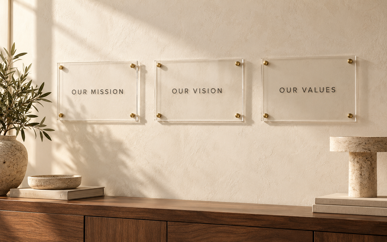
The hardest part of a core values wall is often not choosing the material. It is getting several teams to approve a short piece of language that will be visible every day. Treat the wording as its own deliverable before it becomes artwork. This keeps a typography review from turning into an unexpected debate about the organization’s identity.
The following process is designed for the project owner collecting feedback from leadership, HR, brand, and facilities. It helps distinguish substantive changes from preferences about presentation.
Identify the source of authority
Find the current approved values document and check whether it has been superseded. A slide deck, recruitment page, and employee handbook may contain slightly different versions. Ask the responsible owner which source controls the sign, rather than selecting whichever wording is shortest.
Record the source, date, and approver. If there is no approved version, name the person who can resolve that gap before design work begins. Multiple reviewers are useful; multiple final decision makers often create conflicting instructions.
Give every line a purpose
Separate value names, explanatory sentences, and optional introductory copy. Decide whether the display is meant to name the values or explain how they show up in work. A list of nouns and a set of practical behavior statements are different communication tools.
An illustrative pair is “Clarity” with “Explain the decision and the next step.” This is original example language, not a customer result or recommended universal value. Use words that your organization can explain with real internal examples.
Edit without changing the commitment
Look for undefined abbreviations, mixed grammar, repeated phrases, and inconsistent capitalization. A series that starts with verbs should not unexpectedly switch to vague nouns unless there is a reason. Read the statements aloud to catch awkward phrasing.
Do not quietly soften a promise or strengthen a claim to make a line fit. Changing “we aim to” to “we always” changes the meaning. Send substantive edits back to the content owner and maintain a clean final version alongside the change record.
Review inclusion and interpretation
Ask colleagues from the intended audience how they understand each line. A phrase that sounds energetic to one team may be unclear to another. Where language is translated, use a qualified reviewer familiar with the organization’s terminology and let them inspect the final layout too.
Avoid treating this review as a vote on personal taste. Gather specific questions: Which word is unclear? What action does this statement describe? Does the line contradict another approved communication? Those questions produce more actionable feedback.
Close the wording before the artwork
Set a content approval checkpoint with the exact text in a copyable document. Then ask the sign maker to lay out that version. During the artwork review, check that punctuation, accents, and line breaks have survived correctly.
If someone requests a late wording change, issue a new revision and reconfirm the affected artwork. A brief delay before production is easier to manage than a permanent display that contains a sentence nobody fully approved.
Frequently asked questions
How many reviewers should approve the wording?
Use the people needed for accuracy and ownership, with one named person responsible for consolidating the final response.
Can a designer rewrite the values?
Only within an agreed scope. Design suggestions should not silently become official organizational language.
Should the final sign use quotation marks?
Use them only when appropriate to the approved text. Do not imply an attributed quotation where none exists.
Move approved copy into design
When the wording is final, explore the personalized office wall plaque. Send the clean master text and identify any wording that must remain unchanged during layout.